Communicating with Data in the Tidyverse
居然讲到了css,果断follow啊,还可以复习ggplot2。
- 4 hours
- 15 Videos
- 53 Exercises
- 265 Participants
- 4,350 XP
这种人学习少的,肯定有价值啊。
Timo Grossenbacher 这哥们是个记者?这敢情好,肯定sense好,画图666。
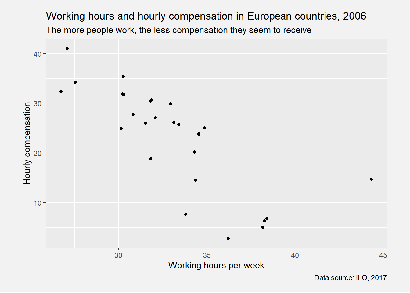
Add labels to the plot | R
# Create the plot
ilo_plot <-
ggplot(plot_data) +
  geom_point(aes(x = working_hours, y = hourly_compensation)) +
  # Add labels
  labs(
    x = "Working hours per week",
    y = "Hourly compensation",
    subtitle = "The more people work, the less compensation they seem to receive",
    title = "Working hours and hourly compensation in European countries, 2006",
    caption = "Data source: ILO, 2017"
  )
ilo_plot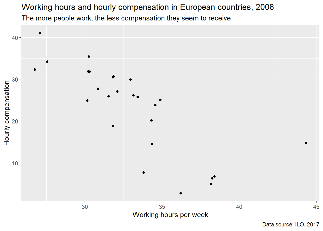
caption位于右下角,作为数据来源说明。
subtitle表达了一定的观点。
Custom ggplot2 themes | R
default比较丑。
视频打不开。
Apply a default theme | R
ilo_plot +
  theme_minimal()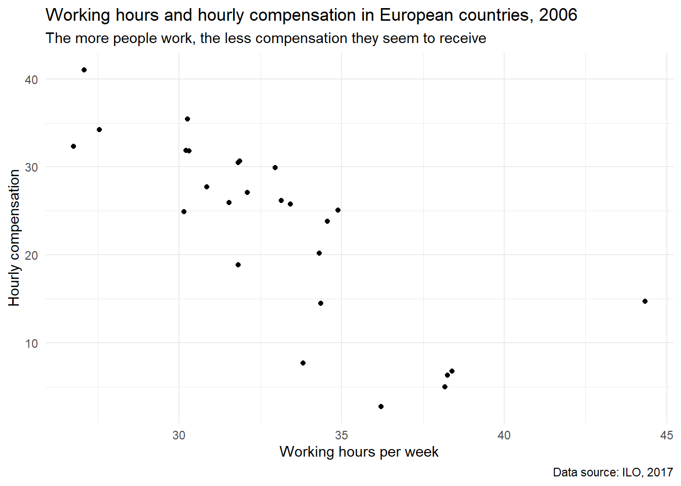
比原图好看。
theme_minimal()。
更多可以看这里。
比如theme_wsj是华尔街日报的风格。
library(ggthemes)## Warning: 程辑包'ggthemes'是用R版本3.6.3 来建造的ilo_plot +
theme_wsj()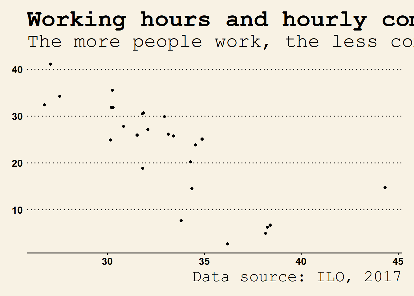
See how quickly you can change the overall appearance of a
ggplot2plot?
Change the appearance of titles | R
ilo_plot +
  theme_minimal() +
  # Customize the "minimal" theme with another custom "theme" call
  theme(
    # text = element_text(family = "Bookman"),
    title = element_text(color = "gray25"), # 字体灰色一点
    plot.subtitle = element_text(size = 12), # 大一点可以看得见
    plot.caption = element_text(color = "gray30") # 字体灰色一点
  )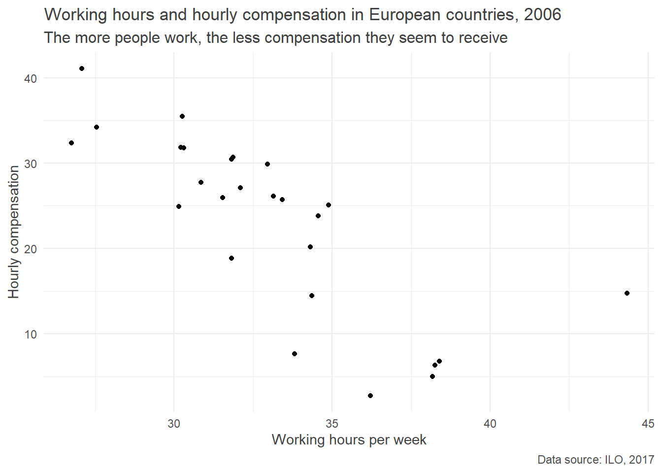
感觉还是没有labs的功能强大。哈哈哈。
Alter background color and add margins | R
注意这个theme可以重复用,不影响。
plot.margin = unit(c(5, 10, 5, 10), units = "mm")告诉具体的单位。
ilo_plot +
  # "theme" calls can be stacked upon each other, so this is already the third call of "theme"
  theme(
    plot.background = element_rect(fill = "gray95"),
    plot.margin = unit(c(5, 10, 5, 10), units = "mm")
  )
背景改成了灰色"gray95",好难看。
Now your plot really stands out from the rest.
Visualizing aspects of data with facets | R
dotplot.
针对facet_grid,
可以用
strip.background和
strip.text。
Defining your own theme function
theme_green <- function(){
  theme(
    plot.background =
      element_rect(fill = "green"),
    panel.background =
      element_rect(fill =
        "lightgreen")
  )
}之前plot.background已经修改过了,这里我们修改下panel.background。
ilo_plot +
  theme_green()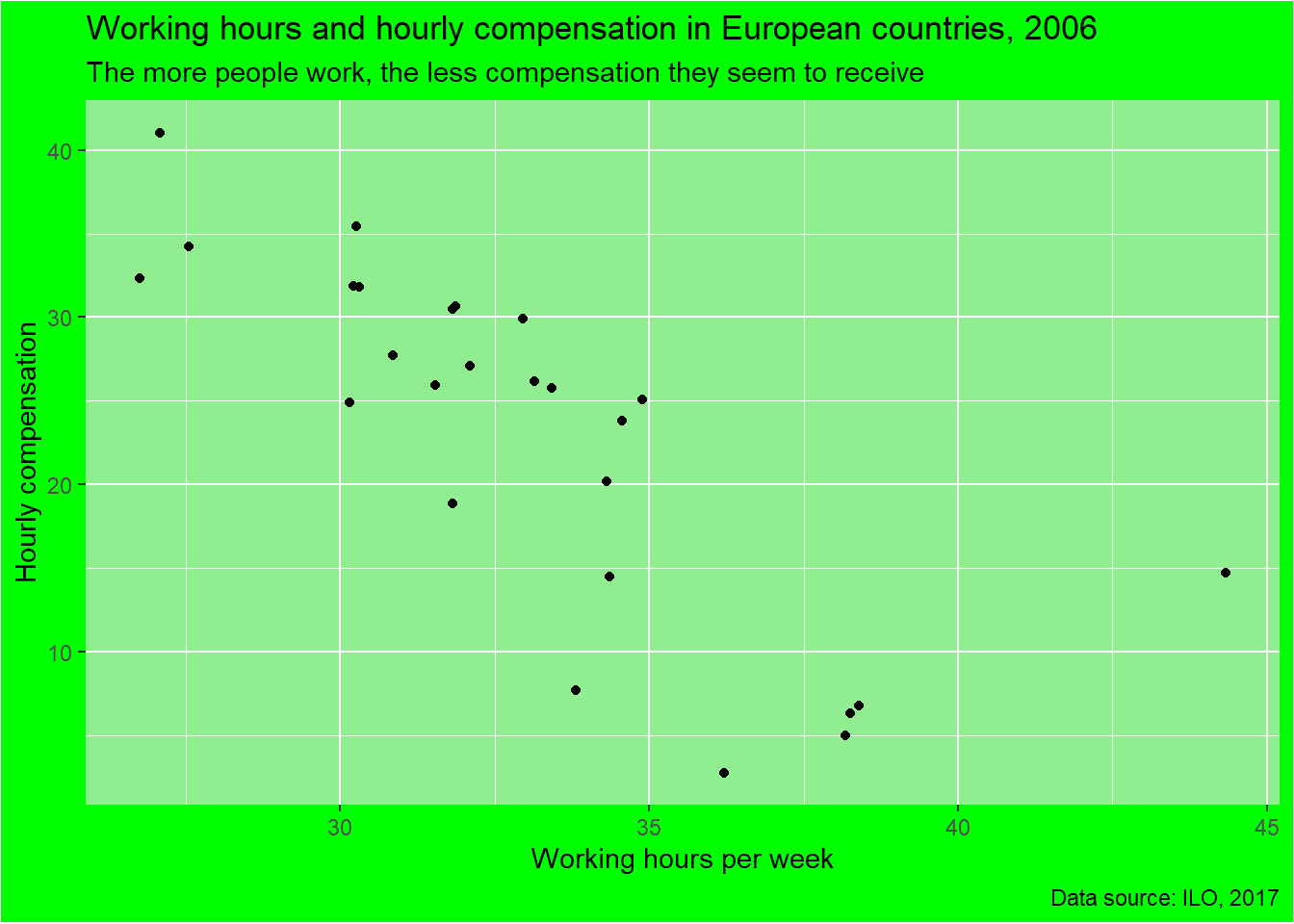
# Filter ilo_data to retain the years 1996 and 1996
ilo_data1 <-
  ilo_data %>%
  filter(year %in% c(1996,2006))
ilo_plot1 <-
ilo_data1 %>%
  ggplot(aes(x = working_hours, y = hourly_compensation)) +
  geom_point() +
   labs(
    x = "Working hours per week",
    y = "Hourly compensation",
    title = "The more people work, the less compensation they seem to receive",
    subtitle = "Working hours and hourly compensation in European countries, 2006",
    caption = "Data source: ILO, 2017"
  ) +
  # Add facets here
  facet_grid(facets = . ~ year) # facets 可以省略
ilo_plot1
丑因为是default的,所有的好看都是从labs开始,
然后在theme和theme_*()开始。
Define your own theme function | R
# Define your own theme function below
theme_ilo <- function(){
    theme(
    # text = element_text(family = "Bookman", color = "gray25"),
    plot.subtitle = element_text(size = 12),
    plot.caption = element_text(color = "gray30"),
    plot.background = element_rect(fill = "gray95"),
    plot.margin = unit(c(5, 10, 5, 10), units = "mm")
  )
}

# For a starter, let's look at what you did before: adding various theme calls to your plot object
ilo_plot +
  theme_minimal() +
  theme_ilo()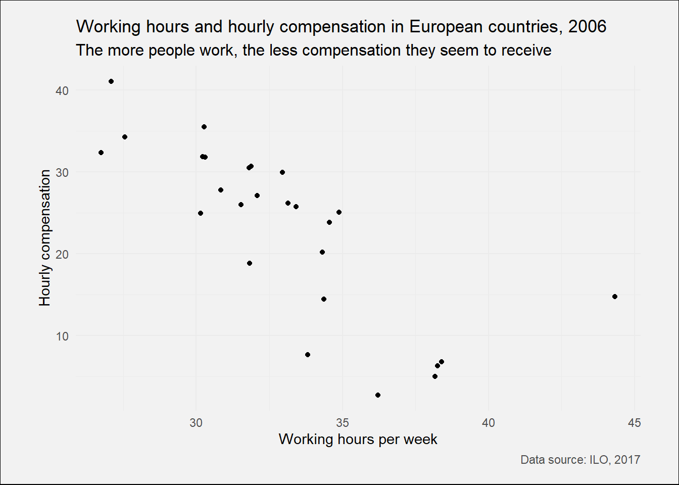
总结就五个东西,
text,plot.subtitle,plot.caption: family字体,col颜色,size大小,
通过element_text构建。
这个是修改背景版本和页边距
plot.background = element_rect(fill = "gray95"),。
plot.margin = unit(c(5, 10, 5, 10), units = "mm")。
# Apply your theme function
ilo_plot1 +
  theme_ilo()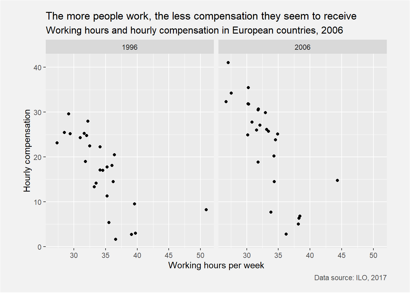
# Examine ilo_plot
ilo_plot1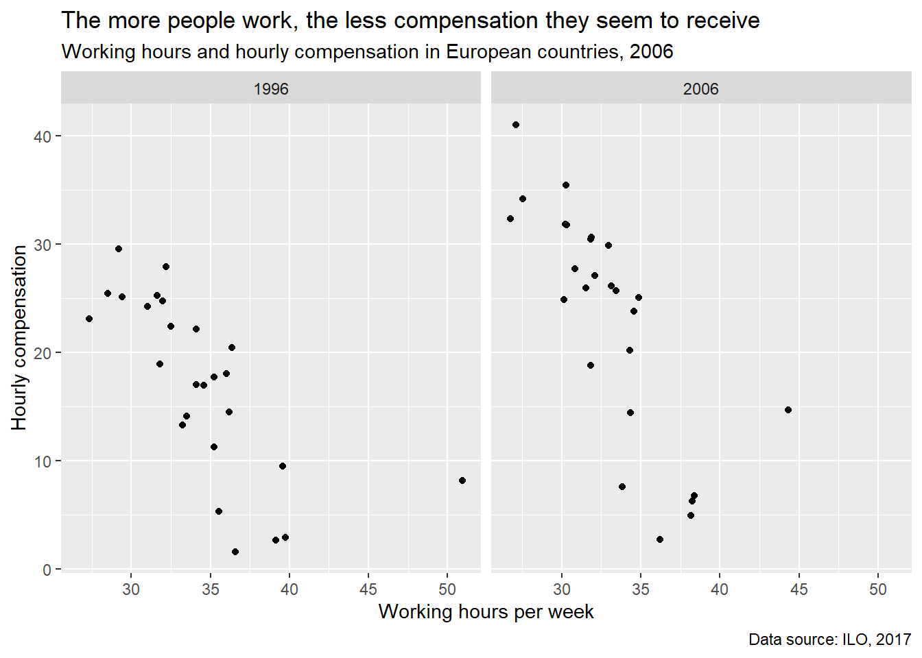
ilo_plot1 +
  # Add another theme call
  theme(
    # Change the background fill to make it a bit darker
    strip.background = element_rect(fill = "gray60", color = "gray95"),
  ) +
  theme(
    # Make text a bit bigger and change its color to white
    strip.text = element_text(size = 11, color = "white")
  )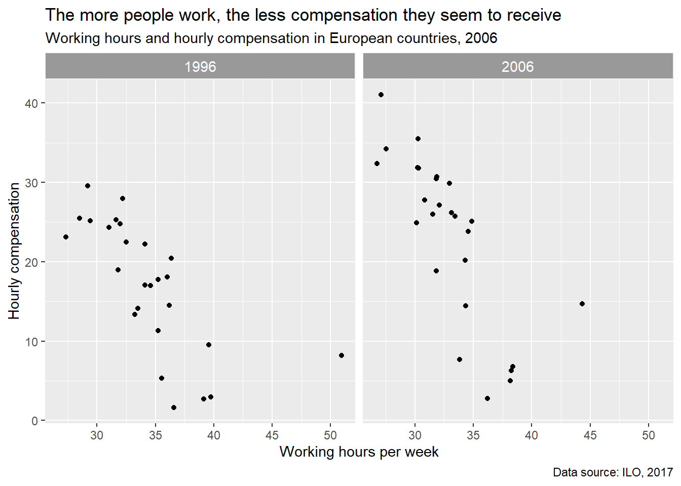
strip.background修改level上的背景颜色。strip.text修改level上的字的颜色。
A custom plot to emphasize change | R
这个dot plot,不是我立即那个,其实是棒棒糖啊。
我可以用这个作为模型比较的表现,秀一波。
ggplot() +
    geom_path(aes(x = numeric_variable, y = numeric_variable))
ggplot() +
  geom_path(aes(x = numeric_variable, y = factor_variable))
ggplot() +
  geom_path(aes(x = numeric_variable, y = factor_variable),
arrow = arrow(___))开始搞geom_path。
但是心里有数,x必须是连续变量,比如\(R^2\)。
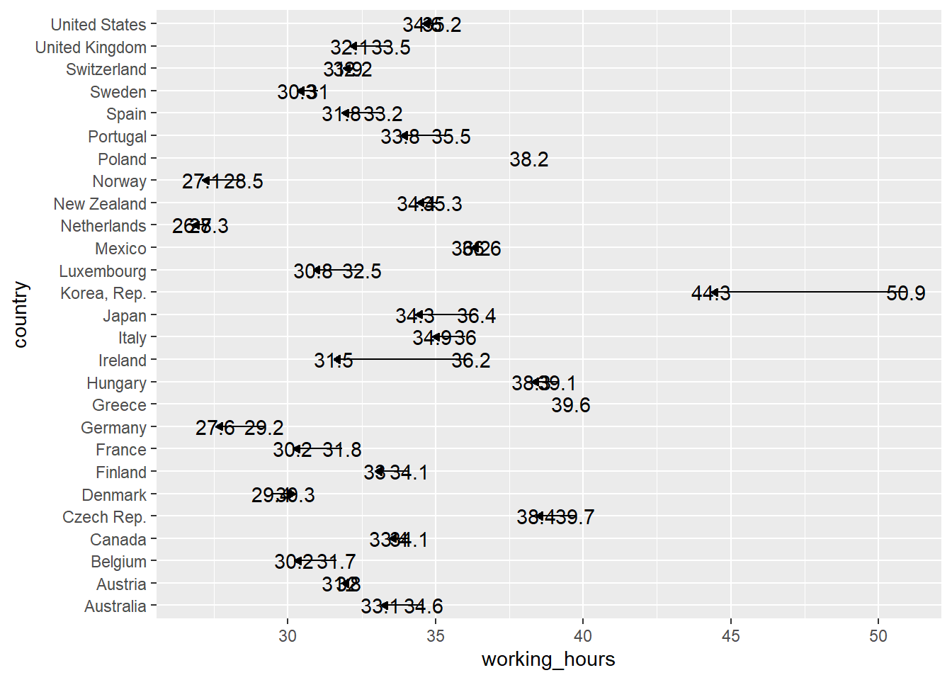
A basic dot plot | R
# Create the dot plot
ilo_data %>%
  filter(year %in% c(1996,2006)) %>%
  ggplot() +
    geom_path(aes(x = working_hours, y = country))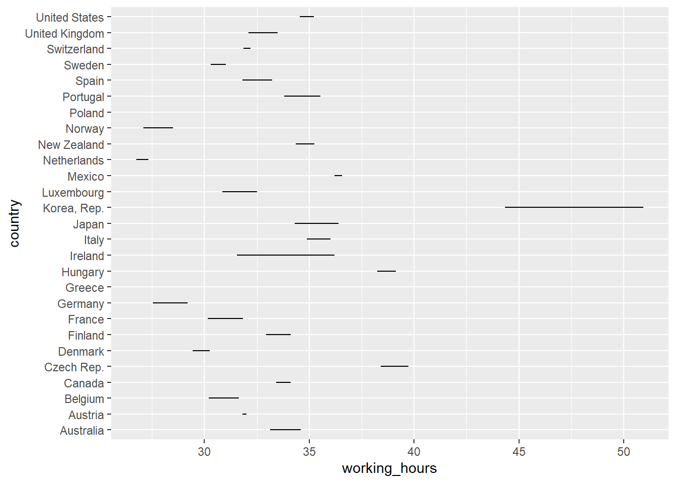
别感到奇怪,先要知道为什么这样,看看数据结构就知道了。
ilo_data %>%
  filter(year %in% c(1996,2006)) %>%
  arrange(country) %>%
  head()
## # A tibble: 6 x 4
## country year hourly_compensation working_hours
## <fct> <fct> <dbl> <dbl>
## 1 Australia 1996 17.0 34.6
## 2 Australia 2006 26.1 33.1
## 3 Austria 1996 24.8 32.0
## 4 Austria 2006 30.5 31.8
## 5 Belgium 1996 25.2 31.7
## 6 Belgium 2006 31.9 30.2所以啊,每个国家都要有一个最大值和最小值。 但是判断不了方向,也就是说你不知道随着时间变了,到底是增加了还是减少了。
Add arrows to the lines in the plot | R
ilo_data %>%
  filter(year %in% c(1996,2006)) %>%
ggplot() +
  geom_path(aes(x = working_hours, y = country),
  # Add an arrow to each path
            arrow = arrow(length = unit(1.5, "mm"), type = "closed"))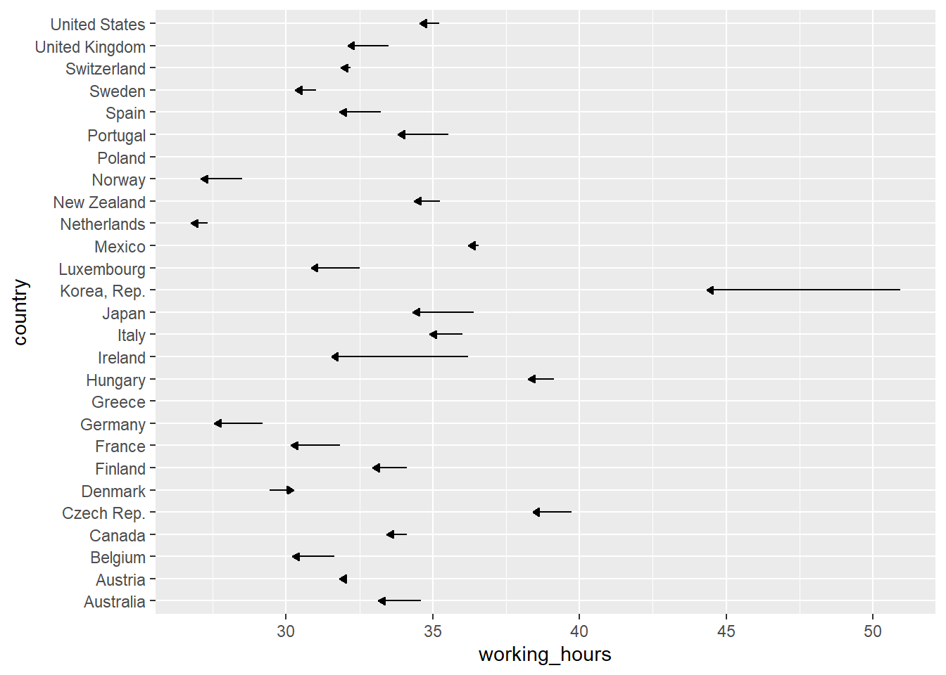
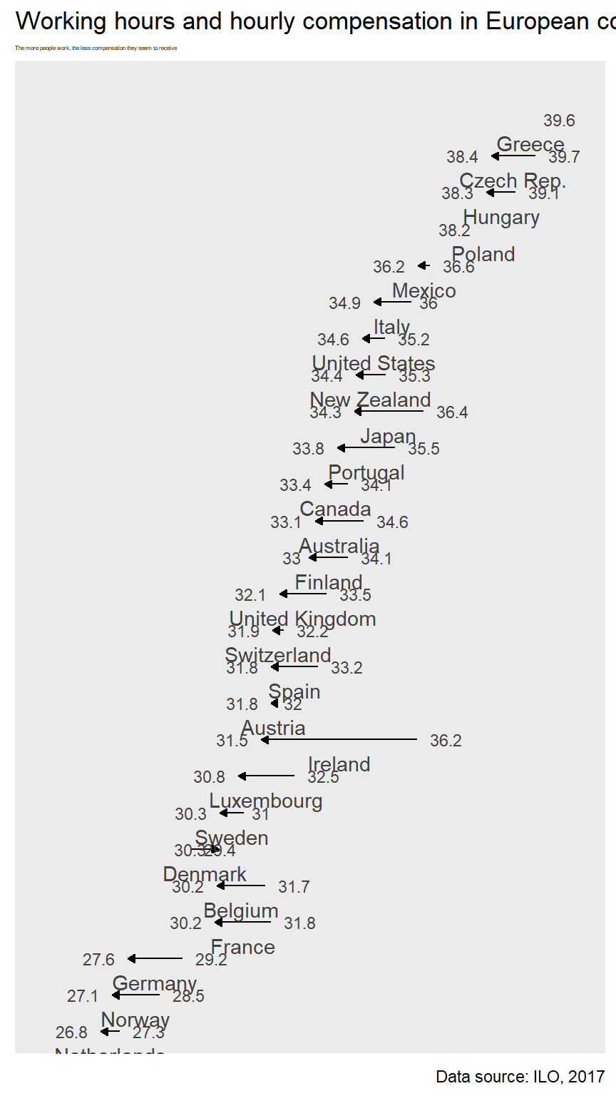
现在总算知道是减小的趋势了吧。 但是没有具体的数字没有意义,好累,所以还是要给出数字。
Add some labels to each country | R
这里通过geom_text()和geom_label()加入数字,但是后者有背景,按需来。
ilo_data %>%
  filter(year %in% c(1996,2006)) %>%
ggplot() +
  geom_path(aes(x = working_hours, y = country),
            arrow = arrow(length = unit(1.5, "mm"), type = "closed")) +
  # Add a geom_text() geometry
  geom_text(
          aes(x = working_hours,
              y = country,
              label = round(working_hours, 1))
        )
但是有点重合,难受。
Polishing the dot plot | R
forcats::fct_rev这个很厉害了!简单。
理解下高配版的fct_reorder。
fct_reorder(country, working_hours, mean))根据,
group_by(country) %>%
summarise(mean(working_hours))来进行fct_reorder哈哈。

hjust和vjust竟然可以这样!一定要搞懂。
ggplot(ilo_data) +
  geom_path(aes(...)) +
  geom_text(
        aes(...,
            hjust = ifelse(year == "2006",
              1.4,
              -0.4)
        )
    )
Reordering elements in the plot | R
library(forcats)
ilo_data %>%
  filter(year %in% c(1996,2006)) %>%
  # Arrange data frame
  arrange(country) %>%
  # Reorder countries by working hours in 2006
  mutate(country = fct_reorder(country,
                               working_hours,
                               last
                               )) %>%

# Plot again
ggplot() +
  geom_path(aes(x = working_hours, y = country),
            arrow = arrow(length = unit(1.5, "mm"), type = "closed")) +
    geom_text(
          aes(x = working_hours,
              y = country,
              label = round(working_hours, 1))
          )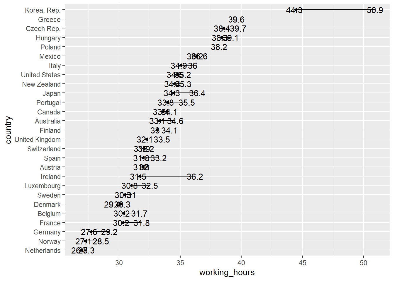
只不过又一个递增的趋势,根据2006年的working_hours来计算。
Correct ugly label positions | R
# Save plot into an object for reuse
ilo_data %>%
  filter(year %in% c(1996,2006)) %>%
  # Arrange data frame
  arrange(country) %>%
  # Reorder countries by working hours in 2006
  mutate(country = fct_reorder(country,
                               working_hours,
                               last
                               )) %>%
  ggplot() +
  geom_path(aes(x = working_hours, y = country),
            arrow = arrow(length = unit(1.5, "mm"), type = "closed")) +
    # Specify the hjust aesthetic with a conditional value
  geom_text(
        aes(x = working_hours,
            y = country,
            label = round(working_hours, 1),
            hjust = ifelse(year == "2006", 1.4, -0.4)
          ),
        # Change the appearance of the text
        size = 3,
        # family = "Bookman",
        col = "gray25"
) 
hjust只平行移动,
year == "2006"向右1.6,
year != "2006"向左0.5。
但是有些字卡到边距上了。
Finalizing the plot for different audiences and devices | R
coord_cartesian vs. xlim / ylim
ggplot_object +
    coord_cartesian(xlim = c(0, 100), ylim = c(10, 20))
ggplot_object +
  xlim(0, 100) +
  ylim(10, 20)
这是两者的区别,所以就是是否删除数据,因此推荐用前者。

因此只需要加入coord_cartesian,
其中xlim = c(19, 41)多一点点即可。
# Save plot into an object for reuse
ilo_plot2 <-
ilo_data %>%
  filter(year %in% c(1996,2006)) %>%
  # Arrange data frame
  arrange(country) %>%
  # Reorder countries by working hours in 2006
  mutate(country = fct_reorder(country,
                               working_hours,
                               last
                               )) %>%
  ggplot() +
  geom_path(aes(x = working_hours, y = country),
            arrow = arrow(length = unit(1.5, "mm"), type = "closed")) +
    # Specify the hjust aesthetic with a conditional value
  labs(
    x = "Working hours per week",
    y = "Hourly compensation",
    subtitle = "The more people work, the less compensation they seem to receive",
    title = "Working hours and hourly compensation in European countries, 2006",
    caption = "Data source: ILO, 2017"
  ) +
  geom_text(
        aes(x = working_hours,
            y = country,
            label = round(working_hours, 1),
            hjust = ifelse(year == "2006", 1.4, -0.4)
          ),
        # Change the appearance of the text
        size = 3,
        # family = "Bookman",
        col = "gray25"
        ) +
  coord_cartesian(xlim = c(25,41))
ilo_plot2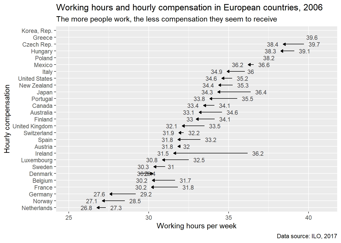
Desktop vs. Mobile audiences 这都考虑到了,真是厉害。还分桌面版和移动版(narrow and tall)。


Optimizing the plot for mobile devices | R
# Compute temporary data set for optimal label placement
median_working_hours <-
  ilo_data %>%
  filter(year %in% c(1996,2006)) %>%
  # Arrange data frame
  arrange(country) %>%
  # Reorder countries by working hours in 2006
  mutate(country = fct_reorder(country,
                               working_hours,
                               last
                               )) %>%
  group_by(country) %>%
  summarize(median_working_hours_per_country = median(working_hours)) %>%
  ungroup()
## `summarise()` ungrouping output (override with `.groups` argument)# Have a look at the structure of this data set
str(median_working_hours)## tibble [27 x 2] (S3: tbl_df/tbl/data.frame)
## $ country : Factor w/ 30 levels "Netherlands",..: 1 2 3 4 5 6 7 8 9 10 ...
## $ median_working_hours_per_country: num [1:27] 27 27.8 28.4 31 30.9 ...ilo_plot2 +
# Add label for country
geom_text(data = median_working_hours,
aes(y = country,
x = median_working_hours_per_country,
label = country),
vjust = 2,
# family = "Bookman",
color = "gray25") +
# Remove axes and grids
theme(
axis.ticks = element_blank(),
axis.title = element_blank(),
axis.text = element_blank(),
panel.grid = element_blank(),
# Also, let's reduce the font size of the subtitle
plot.subtitle = element_text(size = 3)
)
主要是把国家加到横线附近的sense还是有的。
注意这里
{r fig.height=8, fig.width=4.5,fig.align='center'}这里使得图片满足了手机格式。高宽比=\(8:4.5\)且居中。
总结一下,现在就是学会了
labs、theme的各种参数,
好看的模版theme_*,
一些debug的技能。
已经不错了,算是进步了。
HTML manual by RStudio 这个很有用好好学。

在yaml抬头加入
output:
  html_document:
    theme: united
    highlight: monochrome
Add a table of contents | R
toc: true中,
toc指的是
table of contents,就是目录。
toc_float设定了是否跟随翻阅页面时,目录跟着移动。
toc_depth决定了目录的层级。

这里暂时一个目录浮动的例子。
output:
  html_document:
    theme: cosmo
    highlight: monochrome
    toc: true
    toc_float: true
code_folding: hide
这里就是可以保证文中代码都可以隐藏,清爽很多。
Cascading Style Sheets (CSS)
CSS selectors - CSS | MDN 这是引用。
<style>
...
</style>
要是要把应用的css框起来。
body, h1, h2, h3, h4 {
    font-family: "Times new roman", serif;
}serif表示的是衬线字体
sans-serif表示的是无衬线字体,
我也不是特别懂。
pre {
    font-size: 10px;
}
衡量了code字体的大小。
/* Selects any <a> element when "hovered" */
a:hover {
  color: orange;
}
The
:hoverCSS pseudo-class matches when the user interacts with an element with a pointing device, but does not necessarily activate it. It is generally triggered when the user hovers over an element with the cursor (mouse pointer).
:hover就算给超链接上色。
a表示any。
css: styles.css可以外部引用,类似于.bib。
将类似这种用
<style>
...
</style>
框起来的规则,存入一个文档,设置好路径,尽量放在一个文件夹,,然后直接引用就好了。
表格打印的问题,每次都要加上一句knitr::kable()好累。
直接在yaml里面限定,df_print: kable就好了。
这哥们是个追求细节的颜控。
css开了个头就好,这个还没有积累到一定量,才可以用。
但是labs等参数设计还是非常有用的,dot plot也是,也算非常有收获了。